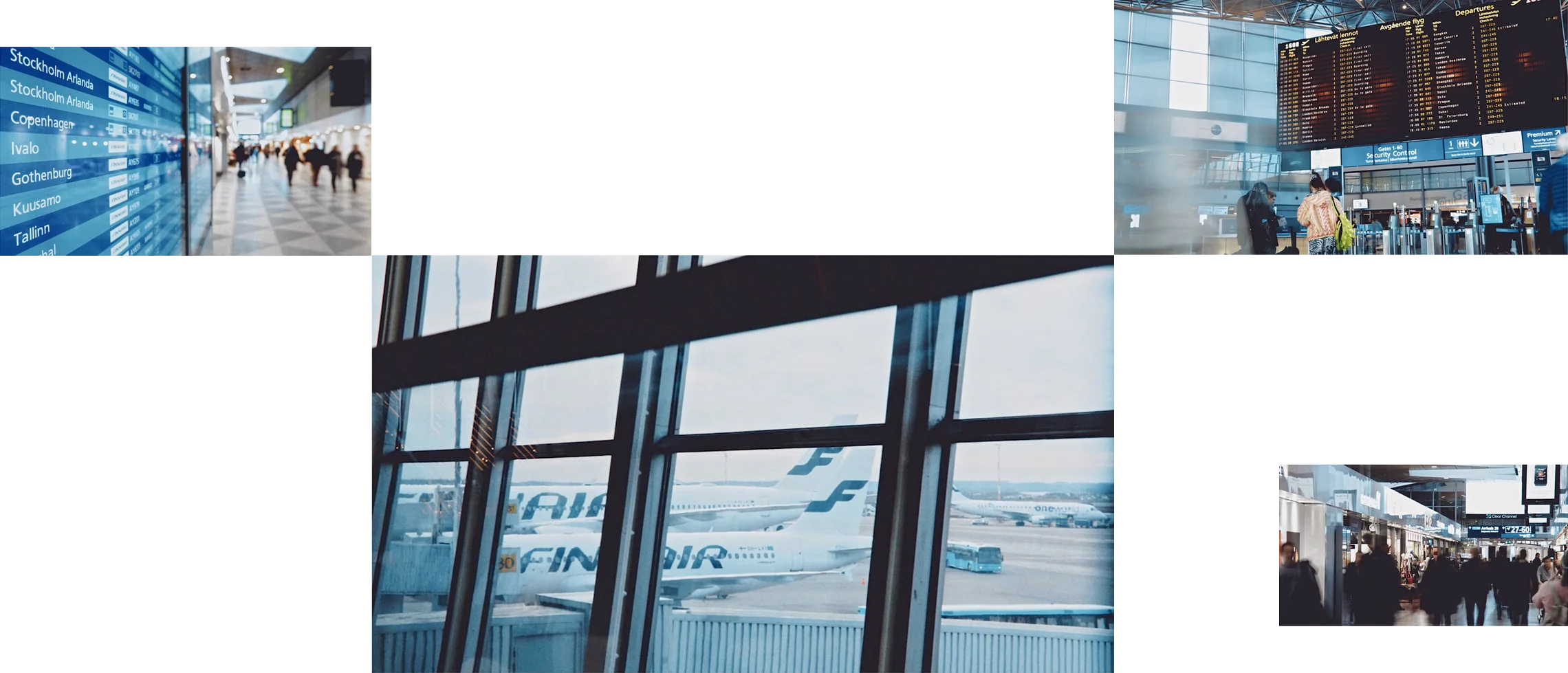
Overview
Over the years, Finavia's digital services had grown through separate projects, creating a fragmented experience for travellers and scattered information that was difficult to maintain. Our mission was to build the foundation for a consistent, scalable digital experience across Helsinki Airport's commercial and non-commercial services.
I led product design and prototyping across digital channels on commercial and non commercial services, working closely with service designers, developers, and business stakeholders. My role also included redesigning the airport's interactive information screens and co-creating an accessibility-first design system.
- Role
- Senior Service and Product Designer
- Timeline
- 2018 — 2020
Project highlights
Omnichannel product design
- Leading product design across commercial and non-commercial airport services
- Connecting experiences across Finavia.fi, airport maps, information screens, and the Airport Guide
- Redesigning Helsinki Airport's interactive information screens
Finavia experience awards
- Interaction awards – People’s Choice Award – 2018
- The lovie awards – Best User Experience and People’s Choice Award – 2019
- The webby awards – Best Visual Design & Function Honoree – 2019
Scalable design foundations
- Creating a shared information architecture and centralised content model
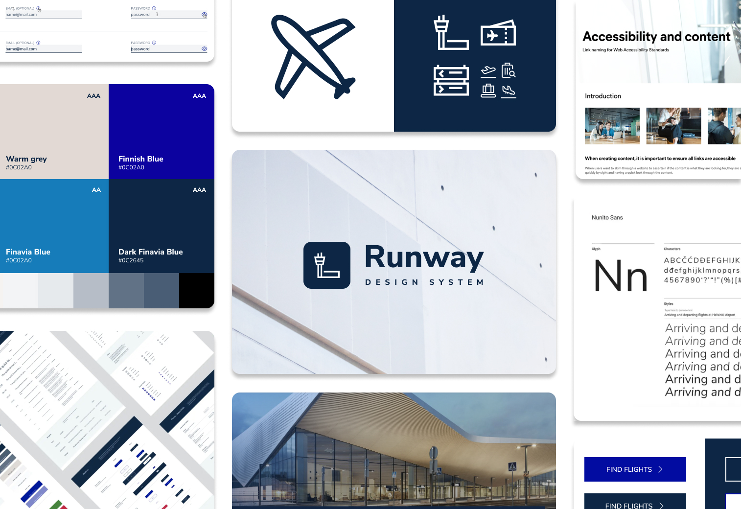
- Co-creating Runway, Finavia's accessibility-first design system
- Aligning design, development, and business stakeholders
Impact (compared to year before changes)
- +400% new registered users
- +52% increase website user engagement
The challenge
Finavia's digital channels looked similar but operated independently, each with its own data sources. This led to inconsistent information, duplicated maintenance work, and a fragmented traveller experience.
The opportunity: How could we build a robust foundation for content and design that enables consistent experiences and supports future growth?
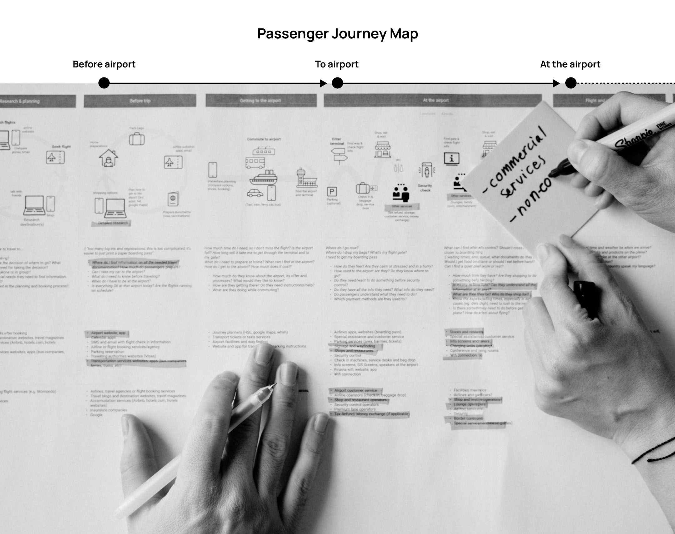
Designing around the passenger journey
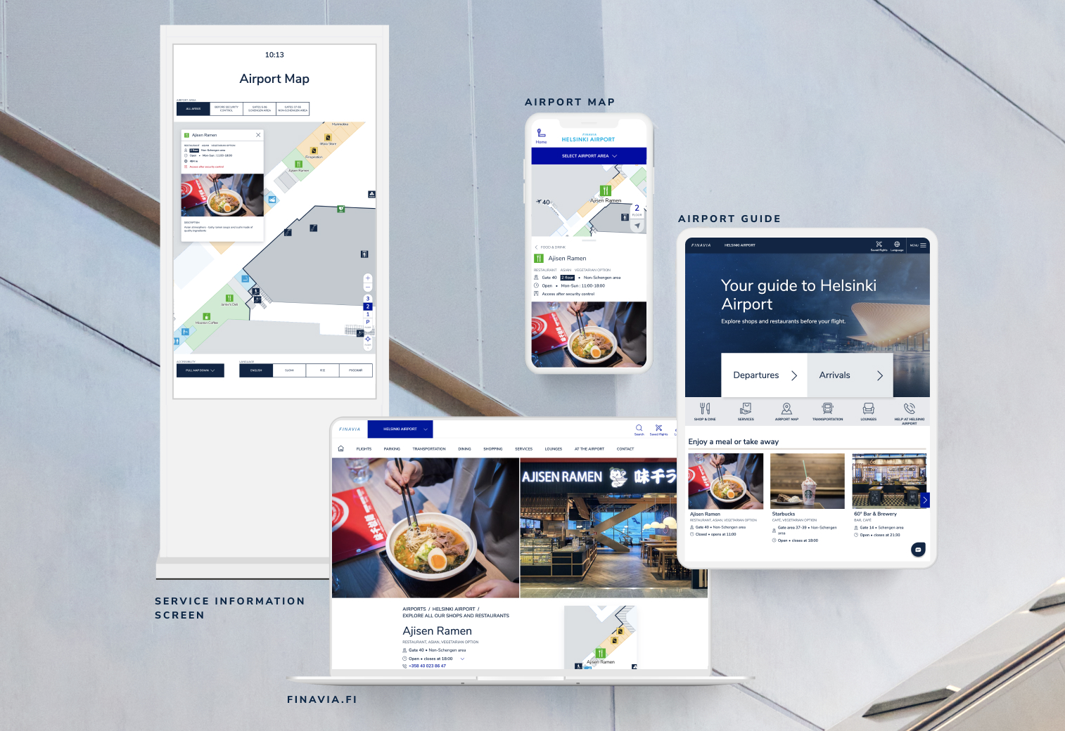
We mapped the full journey from home to gate and found the moments where travellers switched channels. From there we built one content model and one design language, so the same lounge looks and reads the same on a phone, a laptop or a screen in the terminal. We explored practical scenarios:
- Before arriving: A traveller who checks lounge options on Finavia.fi and plans their visit.
- At the airport: A passenger uses an interactive map (Service Info Screens) to find restaurants near their departure gate.
- When something goes wrong: A traveller uses the Airport Guide (avaiable when using the airport connection) to find Lost & Found information.
- Before airport
- At airport
- After airport
Building a shared foundation
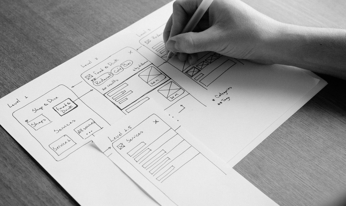
We mapped and categorised airport services, identifying different information needs across commercial and non-commercial services.
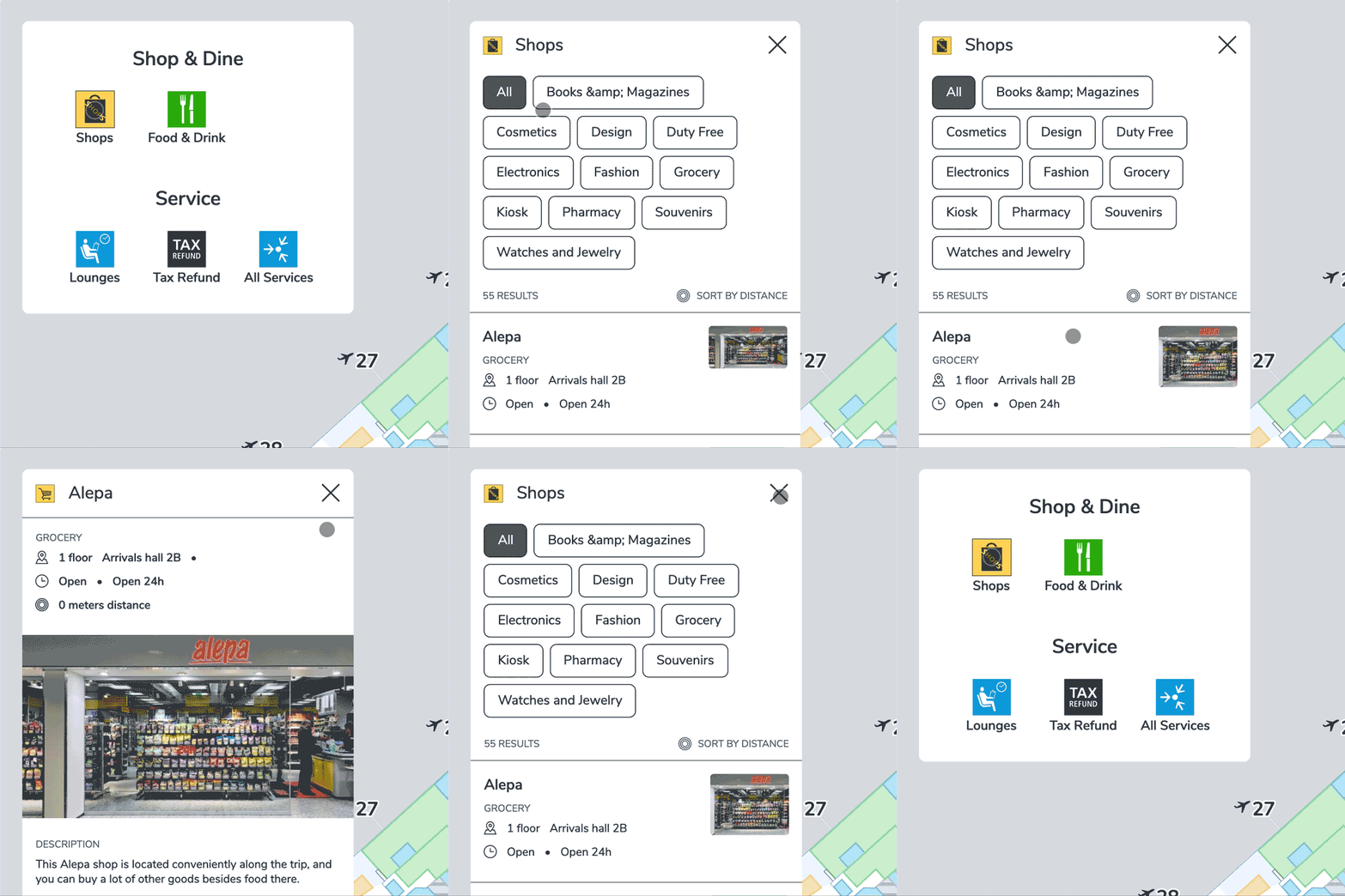
This informed a scalable information architecture with shared categories, tags, and content structures. By centralising content, Finavia could update information once and reuse it across channels, improving consistency and reducing maintenance.
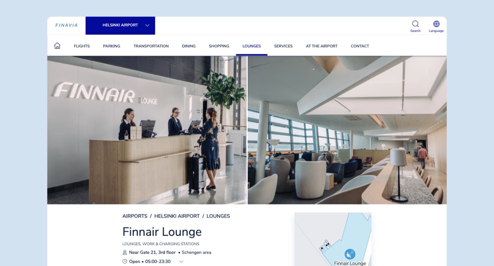
Beyond one touchpoint
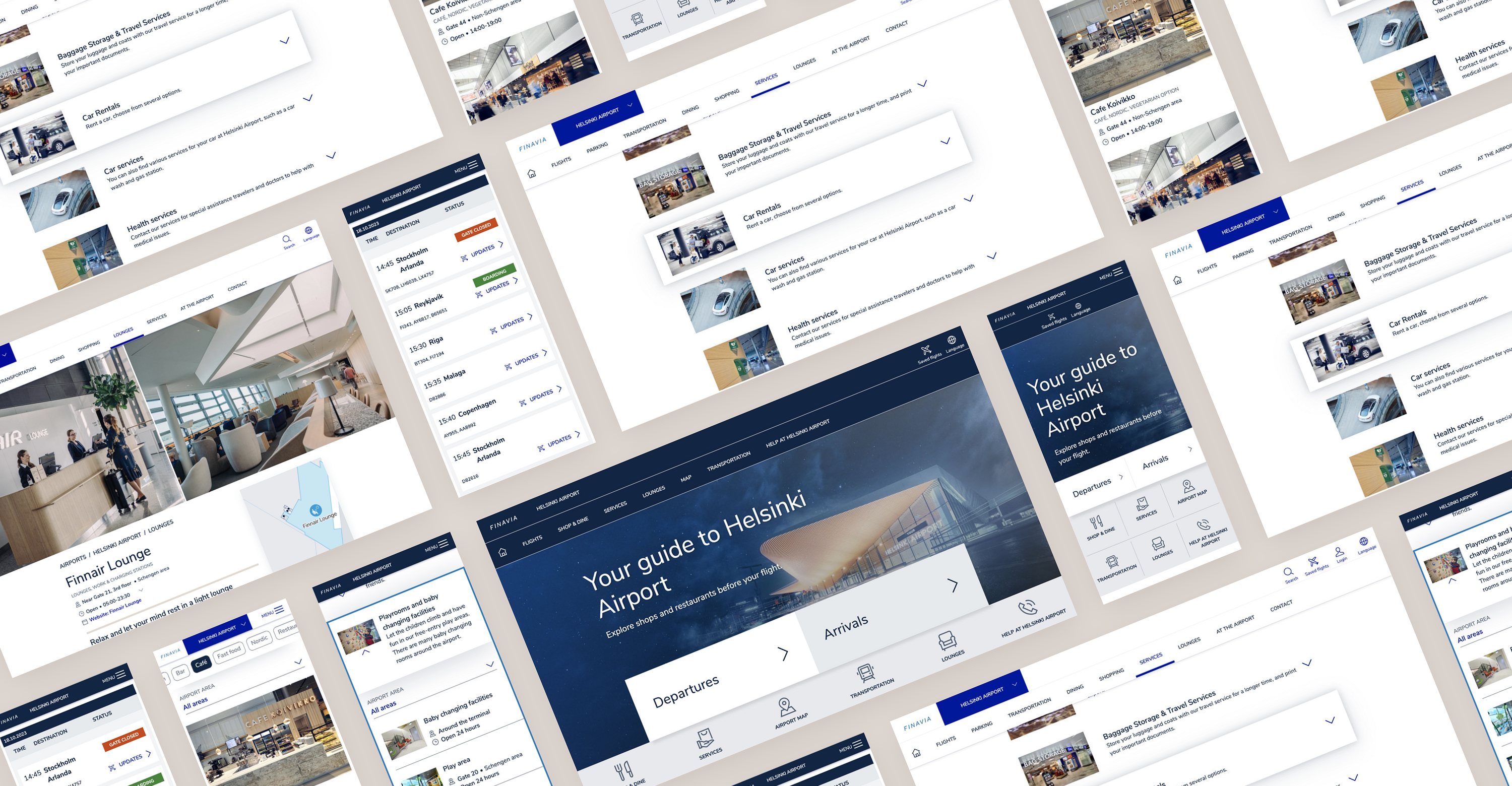
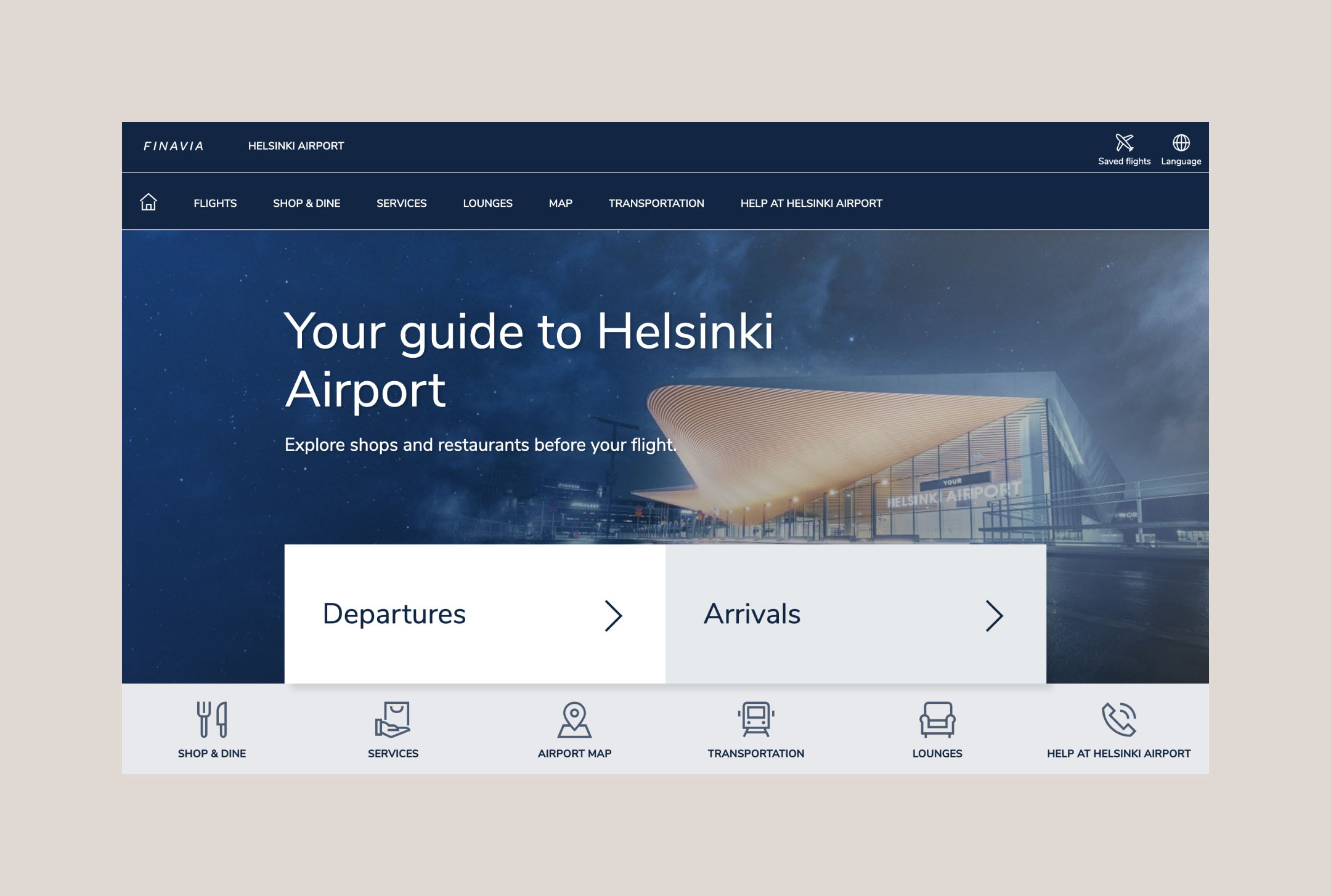
We launched the new experience on Finavia.fi, then expanded to the Helsinki Airport Guide and interactive Service Information Screens.
I led product design and prototyping across these channels, including a complete redesign of the airport's interactive information screens. Each touchpoint shared content, service structure, and design language.
Runway: an accessibility-first design system
To ensure an excellent multichannel experience, we developed Runway Design System, aiming for AA accessibility standard and anticipated future regulatory needs. All customer-facing digital channels at Helsinki Airport leverage Runway DS for a consistent, inclusive experience.
Outcome & impact
One consistent omnichannel experience supported by centralised content, scalable information architecture, and an accessible design system. Travellers could discover services more easily, while Finavia gained a foundation to maintain and grow its digital channels.